UTOP builds Happy City
Whenever facing the crossroads of life from birth to growth to takeoff, UTOP has made many choices putting top priority on happiness.
UTOP’s competitiveness stems from the happiness of its people. Based on the power,
UTOP has created the space of happy life everyone can be satisfied and sympathetic.
UTOP’s competitiveness stems from the happiness of its people. Based on the power,
UTOP has created the space of happy life everyone can be satisfied and sympathetic.
CI
HomeCompanyCI
 |
UTOP's symbol mark represents the company's image as the most important element of CI design system. |
UTOP’s Symbol
UTOP’s initial U in the form of orange-colored petals contains its passion to color the whole world
with warmness and vitality. The four petals signify the company's core value, that is, Customer Focus,
Technology Focus, Nature Focus and Talent Focus.
with warmness and vitality. The four petals signify the company's core value, that is, Customer Focus,
Technology Focus, Nature Focus and Talent Focus.
Logotype
 |
 |
|
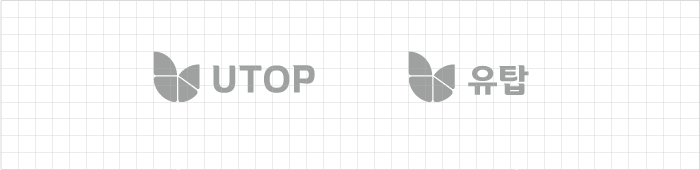
| Horizontal type (English) | Horizontal type (Korean) |
Logotype is an important visual element that delivers UTOP's image in a visual way along with its symbol mark,
and the use of the logotype not combined with the symbol mark is sublated.
Logotype colors must be only two colors of UTOP BLUE (pantone 286C) and UTOP GRAY (pantone cool gray 4U).
The limited use of orange or gold colors is also possible in particular cases, but other colors are not allowed.
and the use of the logotype not combined with the symbol mark is sublated.
Logotype colors must be only two colors of UTOP BLUE (pantone 286C) and UTOP GRAY (pantone cool gray 4U).
The limited use of orange or gold colors is also possible in particular cases, but other colors are not allowed.

Color scheme
PRIMARY COLOR
- UTOP Orange / Pantone 144C
- C 0 M 66 Y 100 K 0
- RGB #F47721
SIGNATURE COLOR
- UTOP Blue / Pantone 286C
- C 100 M 79 Y 3 K 0
- RGB #034F9E
- UTOP Red Orange / Pantone 021C
- C 0 M 83 Y 100 K 0
- RGB #F05323
SUB COLOR
- UTOP Gold
- C 40 M 50 Y 90 K 0
- RGB #97773C
- UTOP Gray
- C 27 M 22 Y 21 K 0
- RGB #BBBDC0
- UTOP Black
- C 0 M 0 Y 0 K 100
- RGB #231F20